Quick answer: To optimize images for website speed, serve every image at the size it is actually displayed, in WebP or AVIF where possible, compressed to a sensible quality, with its width and height set, and lazy-load anything below the fold while giving the main image priority. Those habits often cut a page’s image weight by more than half and directly improve Core Web Vitals.
In this guide
Images are usually the heaviest part of a web page, and very often the largest element on screen when it first loads. That makes them the single biggest lever for page speed. Faster pages keep visitors from bouncing, feel better on mobile data, and score better on the Core Web Vitals that Google uses as part of its page experience signals.
This checklist covers everything that matters, in order of impact.
Why image optimization matters for speed and SEO
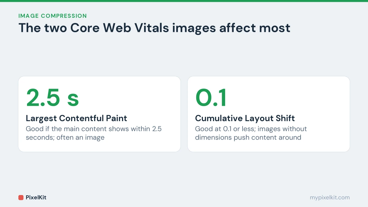
Two of Google’s Core Web Vitals are tied closely to images:
- Largest Contentful Paint (LCP) measures how quickly the biggest element in the viewport appears. On most pages that element is a hero image or a large photo. Google considers 2.5 seconds or less to be good.
- Cumulative Layout Shift (CLS) measures how much the page jumps around while it loads. Images without reserved space are a classic cause. A score of 0.1 or less is good.
An oversized image hurts LCP, and an image with no dimensions hurts CLS. Both are easy to fix.
1. Resize images to their display size
A photo straight from a camera may be 4000 pixels wide. If your content column is 800 pixels wide, the browser downloads five times the width, roughly 25 times the pixels, and then throws most of them away.
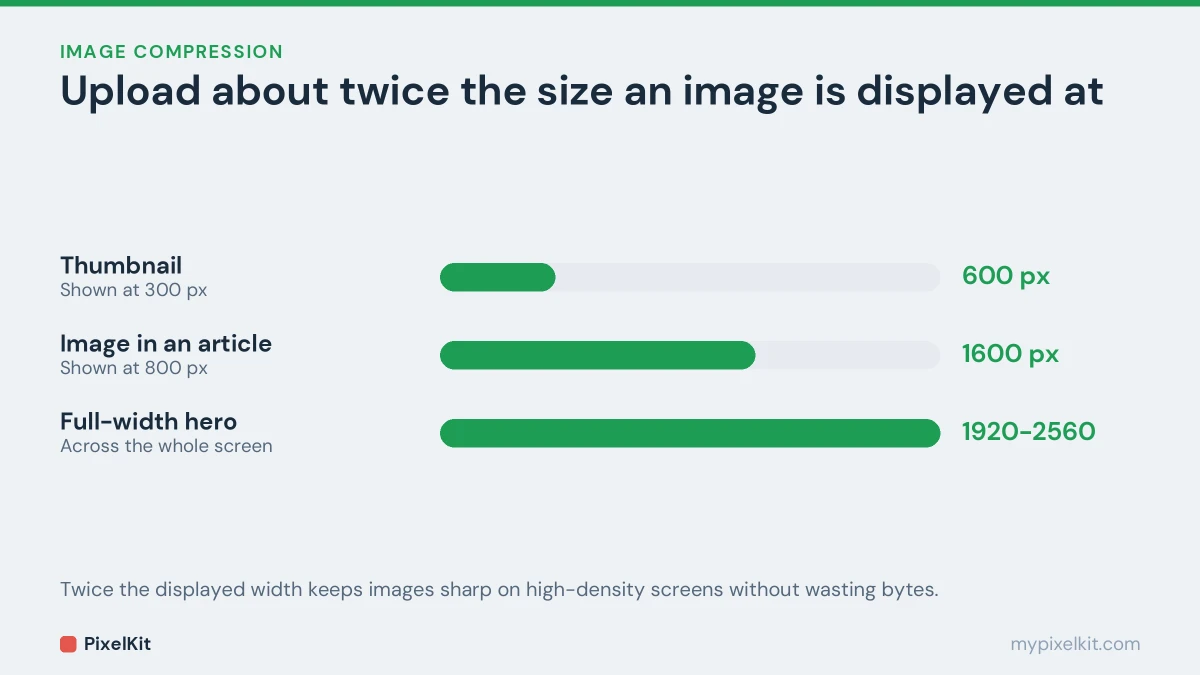
Resize images before you upload them. A good rule is to serve up to twice the displayed width, so the image stays sharp on high-density screens:
- An image shown 800 px wide: upload around 1600 px.
- A full-width hero image: 1920–2560 px is plenty.
- A thumbnail shown at 300 px: around 600 px.
You can set exact dimensions in your browser with Resize Image. For how pixels, display size and print size relate, see image dimensions explained.
2. Use a modern format
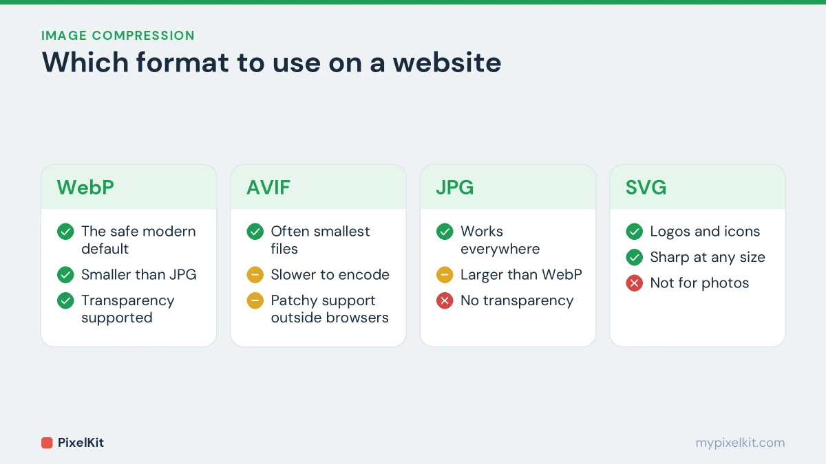
- WebP is the safe modern default. Every current browser supports it, and Google reports lossy WebP files are about 25–34% smaller than comparable JPGs. It also supports transparency, so it can replace PNG for many graphics.
- AVIF is often smaller still and is supported by all major current browsers, but it is slower to encode and not every tool or platform handles it yet.
- JPG remains a solid choice for photos where WebP isn’t an option.
- PNG is best kept for graphics that need to stay pixel-perfect.
- SVG is ideal for logos and icons: it is vector-based, tiny and sharp at any size.
To turn a JPG or PNG into WebP, use Convert Image. If you’re unsure which format suits which image, our explainer on lossy vs lossless compression covers the trade-offs, and JPG vs PNG vs WebP compares the formats side by side.
3. Compress to a sensible quality
For photos, lossy quality settings around 75–85 are a common sweet spot: much smaller files, with a difference that’s hard to spot. As rough targets, keep a full-width hero image under about 200–300 KB and images inside articles under about 100–150 KB.
If you prefer to work in file sizes, Compress Image lets you set a target and re-encodes the image to land under it, without uploading anything. Compress once, from the original, after resizing and converting, not before.
4. Serve responsive images with srcset
A phone doesn’t need the same file as a large desktop monitor. The srcset and sizes attributes let the browser pick the smallest file that will look sharp on the current screen:
<img src="photo-800.webp"
     srcset="photo-400.webp 400w,
             photo-800.webp 800w,
             photo-1600.webp 1600w"
     sizes="(max-width: 700px) 100vw, 700px"
     width="800" height="533"
     alt="Describe what the image shows">
srcset lists the available files and their widths; sizes tells the browser how wide the image will be displayed. The browser does the rest.
5. Always set width and height
When an <img> tag has width and height attributes, the browser can work out the aspect ratio and reserve the right amount of space before the image arrives. Without them, text jumps down the page when the image loads, which is exactly what CLS measures. Set the attributes to the image’s real pixel dimensions and let CSS scale it, for example with max-width: 100%; height: auto;.
6. Lazy-load below the fold, prioritize the hero
Images further down the page don’t need to load until the visitor scrolls near them. Native lazy loading takes one attribute:
<img src="chart.webp" loading="lazy" width="800" height="450" alt="...">Never lazy-load the main image at the top of the page, because that delays LCP. Instead, you can tell the browser to fetch it early:
<img src="hero.webp" fetchpriority="high" width="1600" height="900" alt="...">7. Cache images and deliver them efficiently
Images rarely change, so let browsers keep them. Send a long cache lifetime for image files (up to a year is common when file names change whenever the image changes), and serve them through a CDN so they come from a server close to each visitor. Most managed hosts and caching plugins handle both.
Don’t forget alt text and file names
Speed isn’t the only thing that counts. Descriptive alt text makes images accessible to screen reader users and helps search engines understand them, and a meaningful file name such as blue-ceramic-mug.webp beats IMG_4821.jpg. Write alt text that describes what the image shows, not a list of keywords.
Optimizing images in WordPress
WordPress does a lot of this for you:
- It generates several sizes of every upload and adds
srcsetandsizesautomatically. - It has added
loading="lazy"to images by default since version 5.5, and tries to skip the first large image so LCP isn’t delayed. - It accepts WebP uploads since version 5.8 and AVIF since version 6.5.
- Since version 5.3 it scales down very large uploads, anything over 2560 px, to a more reasonable size.
It still pays to prepare images before uploading: resize them to around 2000–2560 px at most, convert photos to WebP, and compress them. WordPress can only build its smaller sizes from what you give it, and it keeps your original on the server either way.
How to measure the results
Run your page through Google’s PageSpeed Insights before and after. It reports your LCP and CLS and flags images that are too large, in an old format, or missing dimensions. Look at the mobile results first; that is where heavy images hurt most.
Image optimization checklist
- Resized to no more than twice the display width.
- Saved as WebP (or AVIF), with JPG for photos where needed and SVG for logos.
- Compressed once, from the original, to a sensible size.
srcsetandsizesfor images shown at different widths.widthandheightset on every image.- Lazy loading below the fold;
fetchpriority="high"on the hero image. - Long cache lifetime and a CDN.
- Descriptive alt text and file names.
For the fundamentals behind all of this, including how dimensions, format and compression each affect file size, read our complete guide on how to reduce image file size.
Optimize images for website speed: the short version
To optimize images for website speed, serve each image at its display size, use WebP or AVIF, compress to a sensible quality, set width and height, and lazy-load anything below the fold. Good image optimization is a routine rather than a one-off job: optimize images for website uploads before they go live, then check the result in PageSpeed Insights. Sites that optimize images for website delivery this way usually get lighter pages and better Core Web Vitals. For quick one-off jobs, Compress Image and Resize Image handle the first two steps in your browser.
Frequently asked questions
What is the best image size for a website?
There isn’t one number. Match the displayed size, serve up to twice that width for sharp screens, and aim for roughly 100–300 KB per large image. Small images and thumbnails should be much lighter.
Should I use WebP or AVIF?
WebP is the safest default today because every tool and browser handles it. AVIF can produce smaller files, so it’s worth using if your platform supports it, ideally with a fallback.
Does image optimization improve SEO?
Indirectly, yes. Faster pages score better on Core Web Vitals, which are part of Google’s page experience signals, and visitors are less likely to leave before the page loads. Good alt text also helps your images appear in image search.
Sources and further reading
- Largest Contentful Paint (LCP) (web.dev): What LCP measures, the 2.5 second threshold and how images affect it.
- Cumulative Layout Shift (CLS) (web.dev): How layout shift is measured and why image dimensions matter.
- Using responsive images in HTML (MDN Web Docs): A practical guide to srcset, sizes and serving the right image to each screen.
- Browser-level image lazy loading (web.dev): How native lazy loading works and when not to use it.
- Image SEO best practices (Google Search Central): Google's recommendations for alt text, file names and image markup.
- Introducing handling of big images in WordPress 5.3 (Make WordPress Core): How WordPress scales down very large uploads.